
Configuring a Stacked Bar Chart with Two Dimensions
You can configure the Pivot chart Stacked bar chart style to display two dimensions: one dimension defines the y-axis, for example, "Last Status Update" grouped by month. The second dimension, for example, "Status", determines the stacking within each bar. The x-axis will represent the count of vulnerability instances. 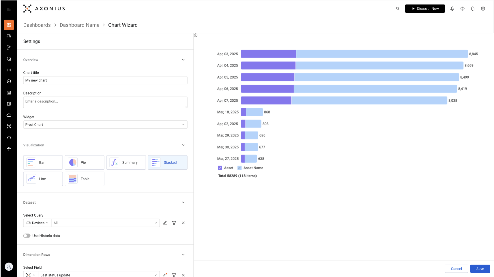
- Under Data, select the asset type and query that defines which asset information to include in the chart.
- Under Dimensions Row, select the field whose value will be the y-axis. This defines what each bar represents.
- Under Dimensions Column, select the field whose value determines the stacking in each bar. In the example given above, each bar represents a date when assets were last updated with stacking by the status.
- Under Metrics, select the field whose value determines the x-axis. In the example, this is the count of vulnerability instances returned by the query.
- Configure the rest of the options and click Save.
The screenshot below shows the configuration for a Stacked bar chart with two dimensions as follows:
- y-axis - OS type
- Stacking - OS end-of-life
- x-axis - The count of assets
Each bar section shows the number of assets with an end-of-life for the specific date. 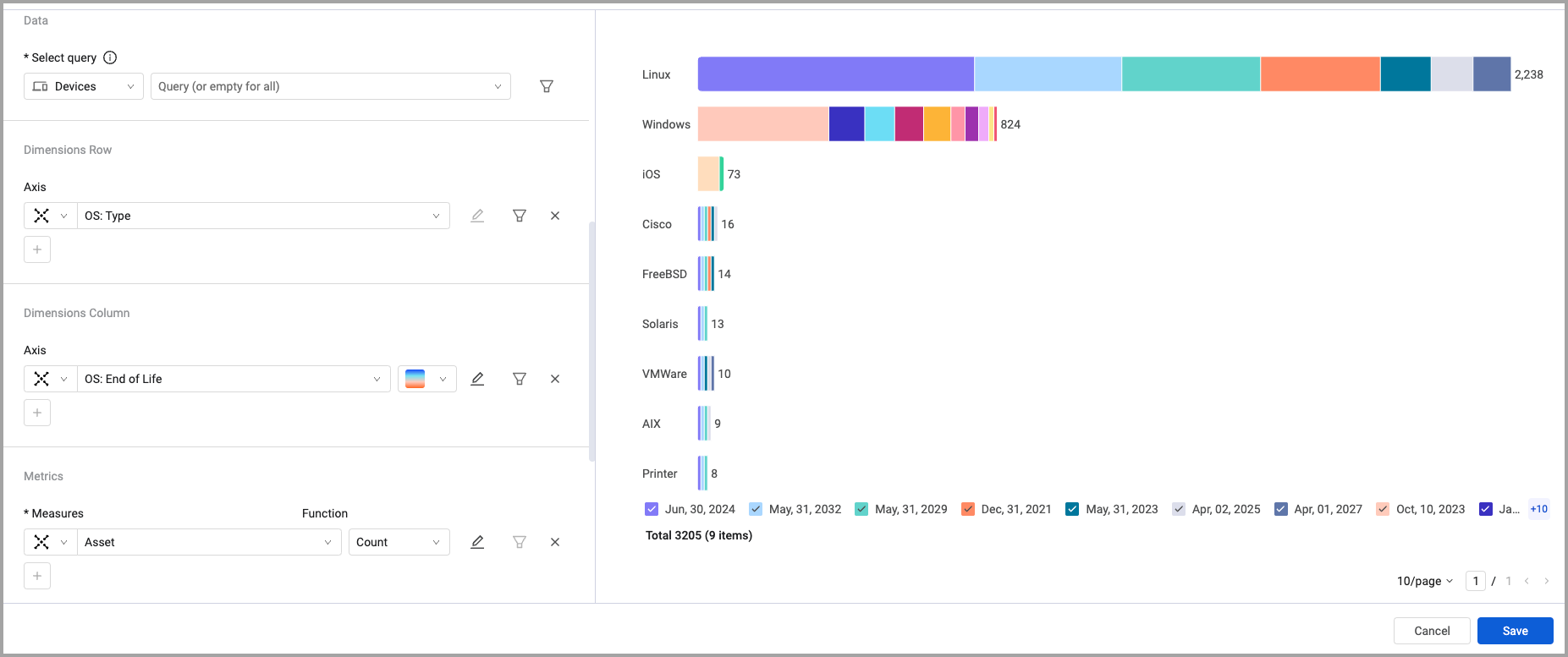
Updated 3 months ago
Did this page help you?