Matrix Data Chart
The Matrix Data chart lets you visualize in a stacked bar chart a data matrix that consists of multiple data intersections between one or multiple base queries and up to three intersecting queries.
To configure a Matrix Data chart:
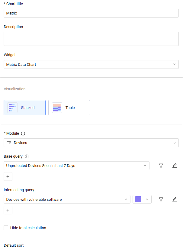
- In the Chart title text box, enter a title for the chart.
- In the Description text box, you can add an optional description.
- From the Widget dropdown, select Matrix Data Chart.
- Under Chart presentation, select the chart presentation style you want.
- Configure the chart according to the presentation style as described in the procedures below.
Configuring a Matrix Data Stacked Bar Chart
You can present the data as a stacked bar chart:
- Select the stacked bar chart.
- From the Module dropdown, select an asset module.
- From Base query, select or create a base query or leave empty for all entities. Learn more about creating a query.
- You may add multiple base queries.
- From Intersecting query, select a saved query or create a new one
- You can add up to three intersecting queries.
- Select Hide Total calculation to prevent totals from being displayed. See Hiding the Total Asset Count.
- Under Segment by, select how to display the data:
- Select Percentage and Show Percentage to see a percentage/normalized chart. See Configuring the Stacked Bar Chart in a Percentage/Normalized Mode.
- Select Number and Show Number to see an absolute chart showing the actual asset counts.
- Click Save.
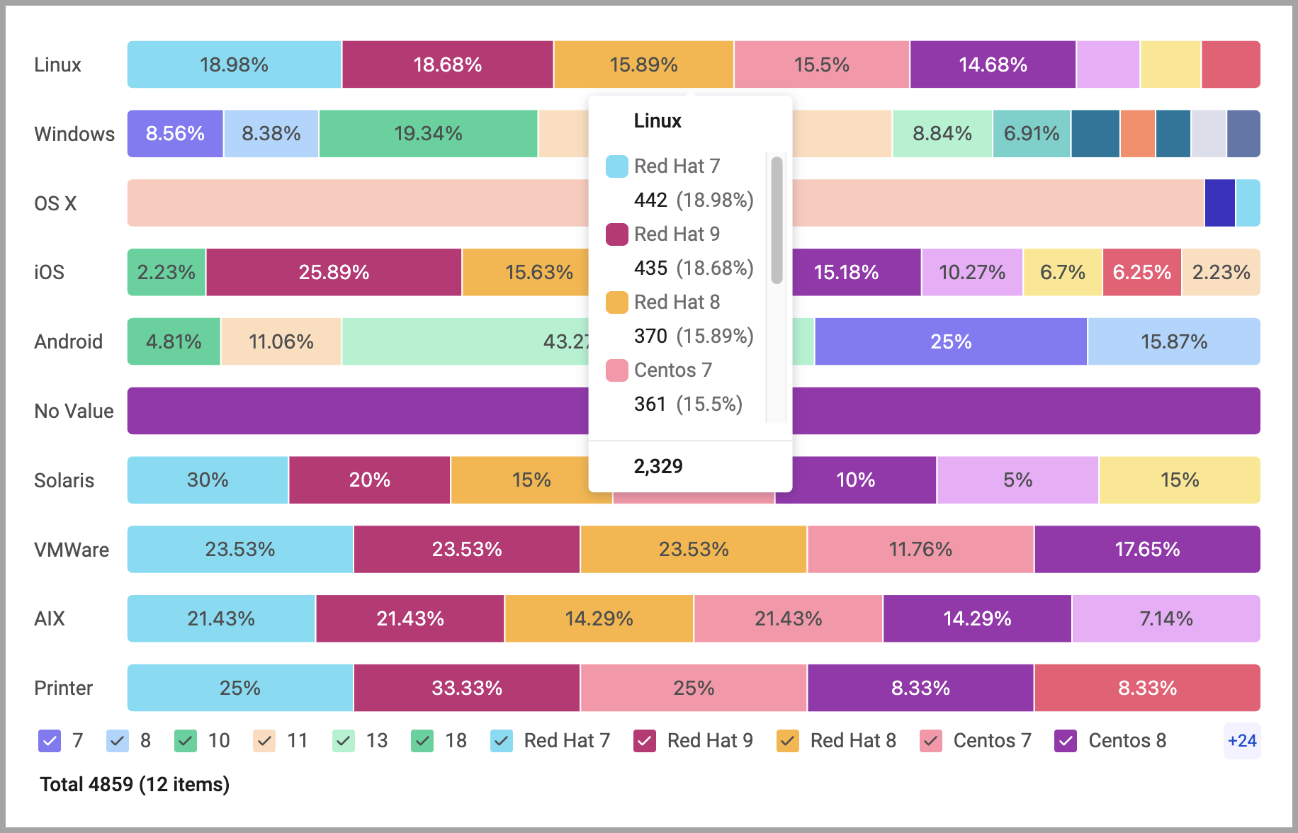
Each bar in the stacked bar chart visualizes the intersections between a specific base query and each of the specified intersecting queries.
.png)
An example of the percentage/normalized chart:
Configuring a Matrix Data Table
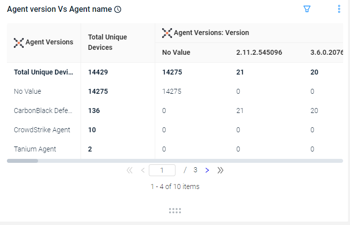
You can present the Matrix data as a table. This shows the common values between two queries, for instance Operating System and Devices.
To configure a Matrix Data Table chart:
- Select the table presentation.
.png)
- From the Module dropdown, select an asset module.
- The Base query defines the rows of the table. From the Base query list, select a saved query or create a new query or leave empty for all entities. From the Field drop down select a field. You can choose an aggregated field, or a field from a specific adapter.
- The Intersecting query defines the columns of the table. Select a saved query or create a new one from the Intersecting query or leave empty for all entities. From the Field drop down select a field. You can choose an aggregated field, or a field from a specific adapter.
Learn more about creating a query. - Select Add rows total to show the total number of unique devices or users for each row.
- Select Add columns total to show the total number of unique devices or users for each column.
- Select Show results with no intersecting values to show results on the table where there are no values in common between the base query and the intersecting query.
- Click Save.
The top 1000 columns are displayed. The table shows the intersection between all assets which have a value in both of the fields.
You can export the table to a CSV file.
Click on an asset bar or table cell to view the Asset summary for the displayed assets. Click the Asset Page to view the assets on their relevant Asset page with the query populated in the Query Wizard.
You can change between the chart presentation styles. When moving from stacked bar chart to Matrix data table, only the first query is used.
Updated 7 months ago