
Setting Threshold and Background Colors
Setting threshold colors is available for the following chart types:
Setting the background color is available for the Pivot chart Summary widget.
Setting Threshold Colors
You can configure visual color-codes to charts to easily identify the status of assets by setting asset count threshold colors. Set threshold colors allows you to set a color to indicate when the asset count exceeds a set threshold. Multiple threshold colors can be set to indicate different levels.
Note
When threshold colors are set, the colors for individual chart segments are disabled.
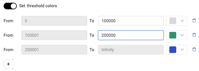
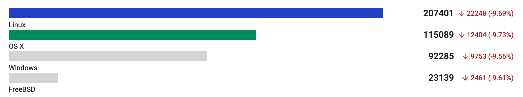
For example, you can set thresholds for asset counts of 10, 25, and 50. When each threshold is met or exceeded, the appropriate color is applied to the chart. Asset counts are set as fixed numbers for most chart types.
The chart is updated with the configured threshold and color selections.
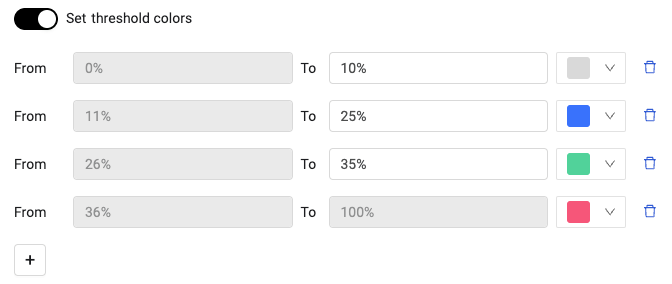
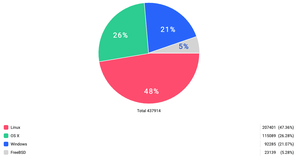
For pie charts, thresholds are expressed as a percentage. When the returned asset count meets or exceeds a set threshold, the configured color is applied to the chart.
The chart is updated with the configured threshold and color selections.
To set threshold colors:
NOTE
The first threshold always has a From value of 0 (zero).
- Toggle on Set threshold colors.
- Do one of the following:
- For all chart types, except for pie charts, enter a To value. If there is another threshold, the From value is automatically set to be one more than the To value in the previous threshold level. Then, in the color palette select a threshold color.
- For pie charts, enter a percentage value in the To field. If there is another threshold, the From value is automatically set to be one more than the To value in the previous threshold level. Then, in the color palette select a threshold color.
NOTE
The sum of all thresholds is limited to 100%.
- To add a threshold level, click
+and enter the appropriate values.
Applying Background Color to Pivot Summary Charts
Use background color on Pivot Summary charts to emphasize KPI values. Apply a single background color to highlight the metric, or use threshold colors to automatically change the background based on value ranges.
When you enable background color:
- The background color is applied to the KPI number area
- Text color automatically adjusts for readability
- If threshold colors are active, the background color changes based on the value and defined thresholds
To apply a static background color:
- In the Chart Wizard, create or edit a Pivot chart.
- In the Data section, select Summary as the chart view.
- Configure your data source, query, and measure.
- In the Presentation section, select a color for your measure (this becomes the background color).
- Enable Apply background color.
The KPI number displays with the selected background color.
To apply threshold-based background colors:
- In the Chart Wizard, create or edit a Pivot chart.
- In the Data section, select Summary as the chart view.
- Configure your data source, query, and measure.
- In the Presentation section, enable Threshold colors.
- Define your threshold ranges:
- Set the From and To values for each range.
- Select a color for each range.
- Click Add threshold color to add more ranges.
- Enable Apply background color.
The KPI number displays with a background color that matches the threshold range containing the current value.
Note
When threshold colors are active, the threshold color overrides the measure color for the background.