
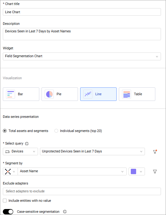
Field Segmentation Chart
The Field Segmentation chart is a single query metric, consisting of a single query and a chosen query field. Use this chart to present the segmentation of values of the chosen field across the data-set given by the query. You can either see data as a histogram, pie chart, timeline, or table. The timeline graph shows the top 20 assets in the time period defined.
When all required fields are configured, a preview of the chart is displayed in the preview pane to the right. You can click on a chart segment to view a list of related assets in an asset page table. The columns of the table are updated to match the chart configuration.
You can assign chart colors to asset count thresholds to easily evaluate the current environment. See Setting Threshold Colors.
To configure a Field Segmentation chart:
As you configure the chart, a preview is created in the left pane.
-
In Chart title, give a title to your chart.
-
In Description, add a description if you want.
-
From the Widget dropdown, select Field Segmentation.
-
Under Chart presentation select the chart presentation type. The available chart type depends on the module you select.
-
Under Select query, from the Module dropdown, select an asset module.
-
From the Query dropdown, select or create a base query or leave empty for all entities. To learn more, see Chart Query Configuration.
- (Optional) To filter the query by any relevant field, click
 next to the selected query and select the filters you want.
- (Optional) To filter the query by any relevant field, click
-
From the Segment by drop-down list, select a field by which the results will be segmented.
- When you select Table view, you can edit the name of the 'Segment by' field and use another name that better fits your needs. To change the name, click the Edit icon
 next to the field. When you use a custom name, a red dot is displayed on the Edit icon.
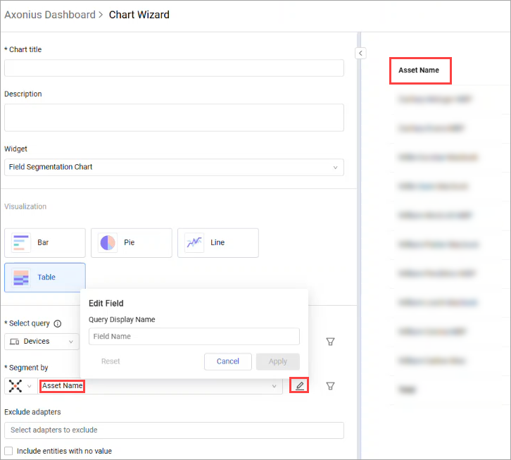
- When you select Table view, you can edit the name of the 'Segment by' field and use another name that better fits your needs. To change the name, click the Edit icon
-
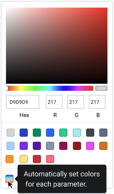
You can select to have Axonius assign colors to the bar chart automatically from the color palette.
- To the right of the Segment by list, click the color palette dropdown. Then, near the bottom of the palette, click the rainbow swatch to have Axonius apply color to the bars. See the example below.
-
From the Exclude Adapters field, you can select one or more adapters that will not be included in the data used to create this chart. When you hover over the arrow, an x appears. Click the x to clear the adapters in the Exclude adapters list.
-
In the Filter by section, optionally configure one or more predefined filters on all the results of the segmented field.
- You can create complex filters by using the AND/OR relations, NOT and parentheses. For more details see Working with the query wizard.
- Each segmented field enables you to select the desired operator based on the selected field type. For more details see Working with the query wizard - Operator drop down section.
- If the segmented field is a simple field, you will be able to filter only on the segmented field.
- If the segmented field is a complex field, you will be able to filter on all fields which are part of the complex field.
-
If the bar chart option is selected, define the default data sort. By default, the data is sorted by descending values.
You can also compare today's query results to a previous date. See Comparing Today's Query Results to a Previous Date. -
If you haven't configured a predefined filter, you can select Include entities with no value to ignore entities that don't have a value for the segmented field and therefore won't be included in the chart results.
- If enabled, you can edit the text displayed in charts when an item has no value to display. By default, the text is 'No Value,' but you can change it to something else, for example, 'None' or 'N/A.'
-
Toggle Case-sensitive segmentation to define whether case will be considered in the data used to create this chart. You can toggle this option off so that the system will ignore the use of case in strings when creating the chart. This means that if the same name is sometimes used with capital letters, and in other cases in lower-case, the system will treat these values as the same value, for instance JOHN, John and JoHn will all be treated as the same value.
- If enabled, each of these strings will be treated as a separate value, and displayed thus in the chart.
- If disabled, all strings with the same characters, but different case, are treated as the same value.
-
Set threshold colors - Enable to set different colors for segments that meet or exceed specific asset count thresholds.
-
You can select Hide Total calculation to hide totals. See Hiding the Total Asset Count for more information.
-
Sorting by - Select how to sort the results in the chart. You can sort by Value or Name and Descending or Ascending.
-
Use historical data - Enable to view query results from a previous date.
-
Compare results to a previous date - Enable to compare current results to results of a previous date.
-
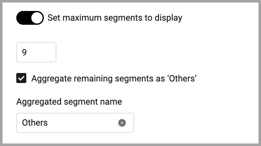
Set maximum segments to display (for bar charts) - Set the maximum number of segment bars to display in the chart. The default minimum is 10. The maximum is 20. When there are more than the set default number of segments, you can aggregate the remaining segments into one by enabling Aggregate remaining segments as ‘Others’. In the Aggregated Segment name field, enter a display name for the aggregation.
-
Click Save.
Timeline Visualization
The timeline visualization shows a trend of the total of the segments and count of all segments as a timeline chart over a set period of time.
-
Select the line presentation.
-
Choose the data series presentation either Total assets and segments or Individual segments (top 20).
- Total assets shows the total assets.
- Individual segments show the results by the query with an individual line for each segment. When each segment is displayed, the top 20 assets are displayed. Since the values of the assets vary over time, the assets which are the top 20 on the latest date are displayed.
-
Configure a query as described above.
-
In Aggregate by, select an aggregation time period: Day, Week, Month Quarter, or Year. Query results for weekly, monthly, quarterly, and yearly time periods are aggregated based on the average values for the selected time period. Each data point for weekly aggregation is the average of all daily values since the last weekly period. And each data point for the monthly aggregation is the average of all daily values since the last monthly period. You can choose to exclude date ranges from the displayed range. The legend reflects the time period selected.
NoteOn the daily aggregation chart, you can click through to the asset list. See Selecting a Table View for more on what data is displayed when you click a chart segment.
-
In the Show results in the last (days, weeks, months or years) field, specify the number of last days/weeks/months/years or a date range to be included in timeline chart. This date range is displayed on the chart that is created.
-
Select Save.
Duplicate Row
The Duplicate Row button .png) is available on each row in the Field Segmentation chart. When on the first row, it duplicates the entire block and on inner rows it duplicates only the selected row.
is available on each row in the Field Segmentation chart. When on the first row, it duplicates the entire block and on inner rows it duplicates only the selected row.
If you have created a bar chart, by default, the top 5 results are displayed. Use the pagination button to view the rest of the results.
To export the entire list of results to a CSV file, click the export button.
Examples
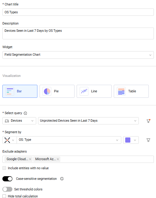
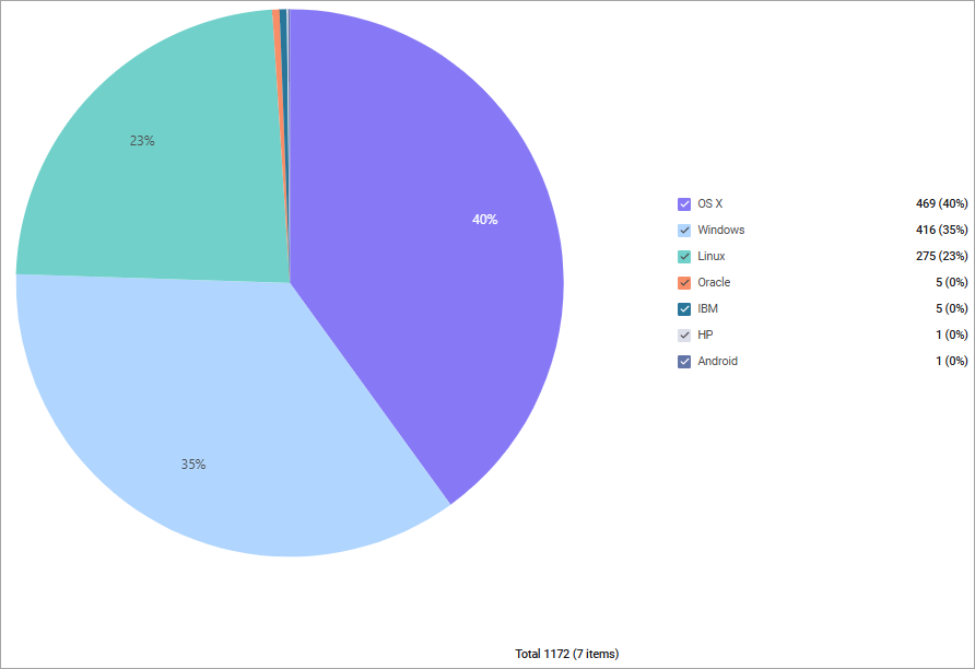
OS Types Segmentation
Use the Field Segmentation chart to visualize all OS types currently discovered on all seen devices.
.png)
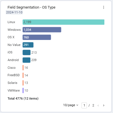
Field Segmentation with Auto-color Assignment
Field Segmentation bar chart with automatic color assignment.
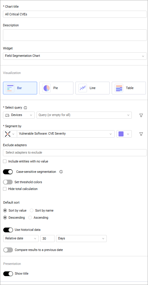
Critical CVEs Segmentation and Trend
Use the Field Segmentation chart to present all critical CVEs currently discovered along all seen devices, and the trend of the total count of critical CVEs over the last month.
.png)