
Field Summary Chart
The Field Summary chart is a single query metric, consisting of a single query and a chosen field. Use this chart to present the calculated outcome (average, count, count true, count false, sum) on the values of the chosen field across the dataset given by the query. You can choose to display data either as a chart or as a timeline chart. You can use the timeline chart to track the values of a field over time.
When all required fields are configured, a preview of the chart is displayed in the preview pane to the right. You can click on a chart segment to view a list of related assets in an asset page table. The columns of the table are updated to match the chart configuration.
To configure a Field Summary chart:
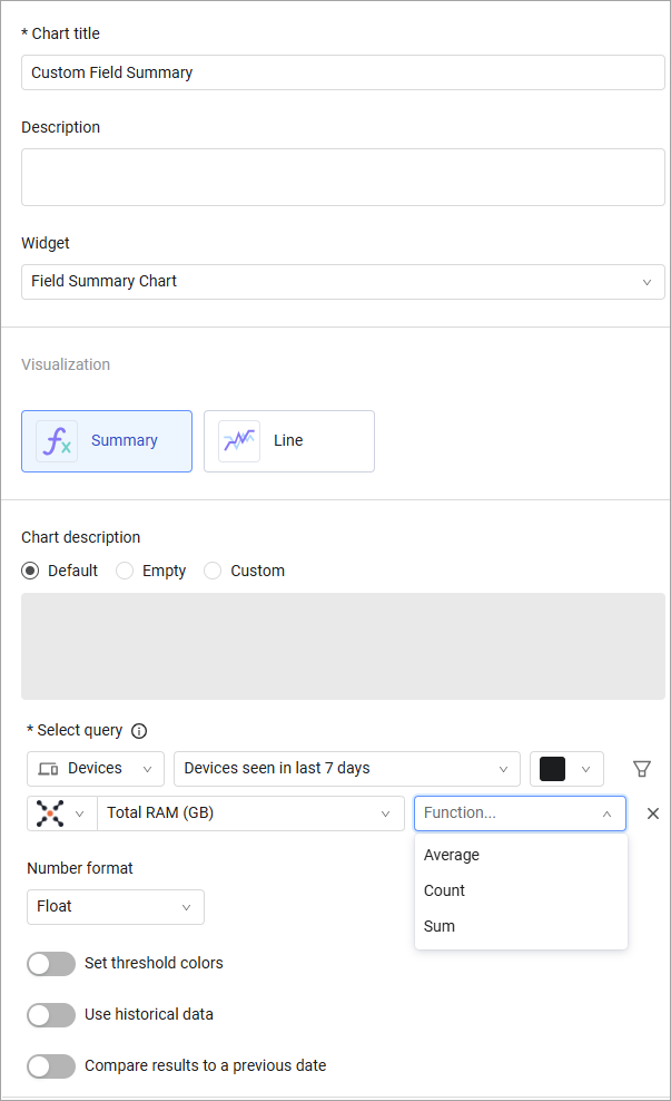
- In the Chart title text box, enter a title for the chart.
- In the Description text box, you can add an optional description.
- From the Widget list, select Field Summary Chart.
- Chart presentation – Select the chart presentation, bar chart or timeline view.
- Chart Description – Specify a chart description type: Default, Empty, or Custom. If you choose 'Custom', type a value of up to 250 characters.
- From the Module list, select an asset module.
- From the Query list, select or create a base query or leave empty for all entities. Learn more about creating a query.
- Text color – Select the color of the text to display.
- Select a field to run the function.
- The available functions are based on the type of the field you select and vice versa. The fields available depend on the module you select.
- If you chose the Average or Sum function, you can select only integer type fields.
- If you chose the Count function, you can select all the fields except Boolean type fields.
- If you chose a Count True or Count False function, you can select only Boolean type fields.
- Select a function to calculate:
- Average
- Count
- Count True
- Count False
- Sum - Learn how the Sum function works in charts.
- Number format – Set the number format for the display:
- Float (default)
- Ceiling – round the value up to the next integer
- Floor – round the value down to the preceding integer
- Round – round the number according to rounding rules when the value is
<.5 - Round down, when the value is>.5 - Round up
-
Timeline Settings - When you choose timeline view, set the following:
-
In Aggregate by, select an aggregation time period: Day, Week, Month Quarter, or Year. Query results for weekly, monthly, quarterly, and yearly time periods are aggregated based on the average values for the selected time period. Each data point for weekly aggregation is the average of all daily values since the last weekly period. And each data point for the monthly aggregation is the average of all daily values since the last monthly period. You can choose to exclude date ranges from the displayed range. The legend reflects the time period selected.
NoteOn the daily aggregation chart, you can click through to the asset list. See Selecting a Table View for more on what data is displayed when you click a chart segment.
- Set one of the following:
- Show results in the last x days – select a number and a time period, days, weeks, months or years.
- Or show results in date range – Set a start and end date.
In the graph that is created when you click on a point in the graph it opens the query in the Devices page.
-
-
You can also:
- Assign chart colors to asset count thresholds to easily evaluate the current environment. See Setting Threshold Colors.
- Compare today's query results to a previous date. See Comparing Today's Query Results to a Previous Date.
-
Click Save.
The Sum Function in Charts
The sum function is designed to handle aggregated fields (i.e., fields with multiple numeric values) to ensure accurate aggregation. The sum function calculates the average of aggregated values within a specific field, and only after that sums the fields. This method allows for more meaningful aggregation, especially when dealing with complex datasets where fields can have varying numbers of values (i.e., 'Free RAM').
The following describes in detail how the system calculates the sum:
- The system calculates the average of nested values. For each asset, if a field contains multiple numeric values, the system first calculates the average of these values.
- The system then sums these averaged values (i.e., the average for each field with multiple values) across all relevant assets.
The following example shows how sum works on an aggregated field.
Example
Consider three assets with a field Field A containing the following nested values:
- Asset 1: Field A = [10, 20, 30]
- Asset 2: Field A = [5, 15, 25]
- Asset 3: Field A = [12, 18, 24]
The system calculates the sum of Field A in these three assets as follows:
-
Calculates averages in the three assets:
- Asset 1: Average of Field A = (10 + 20 + 30) / 3 = 20
- Asset 2: Average of Field A = (5 + 15 + 25) / 3 = 15
- Asset 3: Average of Field A = (12 + 18 + 24) / 3 = 18
-
Adds the averages.
- Sum of Field A across the three assets = 20 (Asset 1) + 15 (Asset 2) + 18 (Asset 3) = 53
Viewing a List of Assets Represented by the Chart
Once the chart configuration is saved and it has been populated with data, you can click the chart to see a list of the assets represented by it in one of the asset pages. The query configured in the chart is populated into the query bar above the list and into the Query Wizard.
NOTEThere are cases when the query configured in the chart was written or edited in the query bar of the Queries page as an Axonius Query Statement, and not in the Query Wizard, and then run. If you configure a chart with that query and then click the chart to see a list of assets, the query parameters are not populated into the Query Wizard.
Examples
For example, the number of Windows OS type devices on the system and the average RAM usage across all devices for last scan. Click on the value to open the query in the devices page.
.png)
For example, the average of total RAM on devices see in the last 7 days. Mouse over to see the values on each point. Click on a data point to open the query on the devices page.
.png)
Updated 15 days ago