
Donut Chart Visualization
The Donut visualization is available in the following charts:
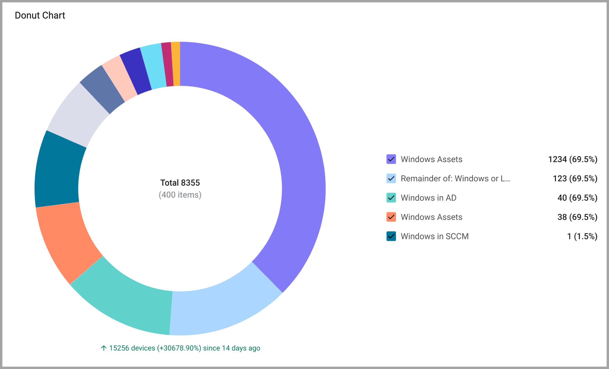
The Donut chart visualizes data in a donut shape and displays the total value in the center. A legend of segments is displayed, and you can select which segments to show. You can also set threshold colors and a background color.
To configure a donut chart:
- On any editable dashboard, click Add Chart or edit an existing chart.
- In the Name field, enter a descriptive name for the chart.
- From the Widget list, select one of the chart types that support a donut visualization.
- Under Visualization, select Donut.
- Under Data
- Under Module, select an asset module and the query that will define which assets to include.
- Under Schema, select the schema to use, and whether to base the chart on historical data.
- On a Pivot Chart, under Dimensions, select the fields that determine the category of assets represented by the chart.
- On a Pivot Chart under Metrics, select the field whose value is measured per the dimension.
- Configure Calculationand Presentation settings.
- Click Save. The chart is displayed on the current dashboard.
Updated 2 days ago
Did this page help you?