Pivot Chart Table Visualization
The Pivot chart Table visualization can display data of simple configurations as well as complex data configurations.
The table has the following capabilities:
-
Expand/collapse rows - All rows with sub-rows can be expanded.
-
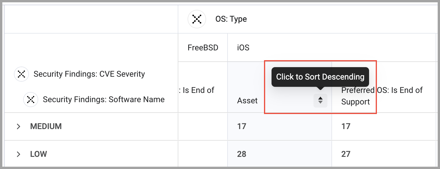
Column and row sorting - (available in the chart wizard) Click on a column header to sort the rows according to the values in that column. In the chart preview, hover over a column to see the sorting arrows and then click to sort by ascending/descending. Sorting in another column sorts all rows according to the values in that column.
-
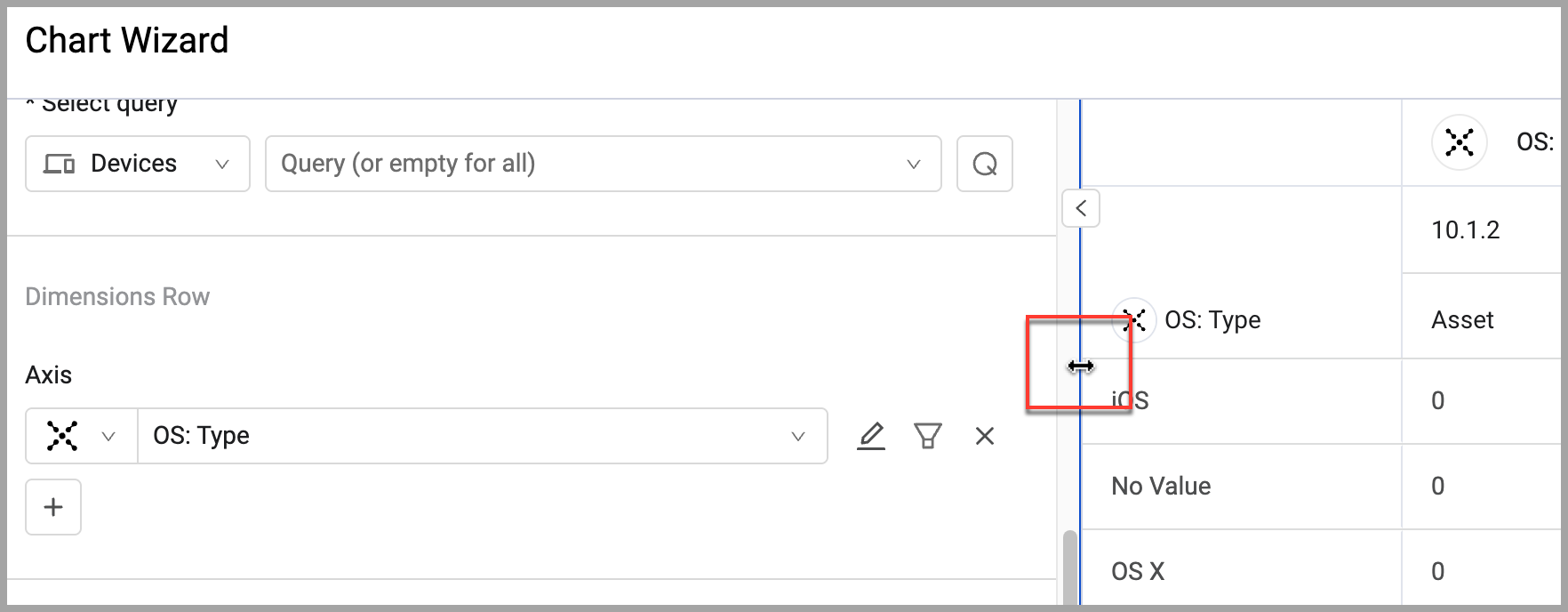
Adjust column width - Column width can be adjusted.
-
Configure unlimited dimensions - You can configure as many dimensions as you need.
-
Infinite scroll - When a table displays large amounts of data it will scroll indefinitely.
-
CSV export - Table data can be exported to CSV.
-
Resize the chart preview - The chart preview can be resized so you can see more detail.
-
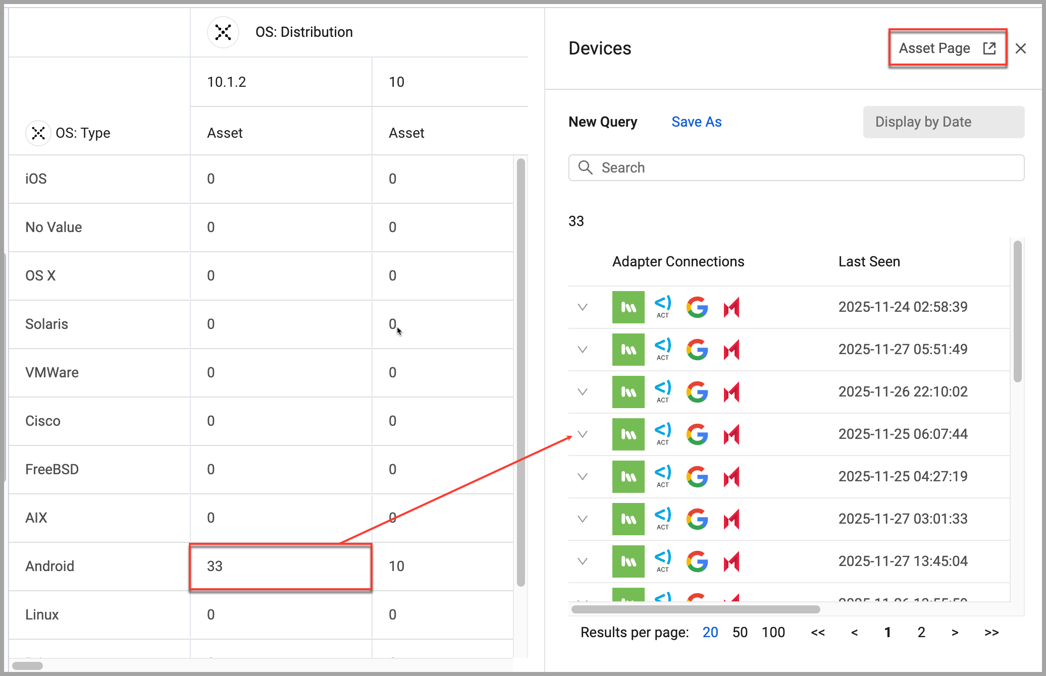
Click-through on each cell - Click on a table cell to open a drawer listing all assets represented in that table cell. In the drawer, click Asset Page to open the Asset page listing the same assets for further investigation. The drawer can be expanded as well.
NoteWhen a table has more than 1 million segement calculations, performance may be slower than expected.
To configure a Pivot chart with the Table presentation:
-
On any editable dashboard, click Add Chart or edit an existing chart.
-
In the Name field, enter a descriptive name for the chart.
-
From the Widget list, select Pivot Chart.
-
Under Visualization, select Table.
-
Under Data, select an asset module and the query that will define which assets to include.
-
Under Dimensions Row, select the field whose values will be on the rows of the chart. You can select multiple dimensions.
-
Under Dimensions Column, select the fields whose values will constitute the columns.
-
Under Metrics, select the fields whose value is measured per the axis and the function. Multiple metrics can be configured.
-
Under Calculation, you can configure these options:
-
Include entities with no value
- Display Name - When Included entities with no value is selected, you can set a custom value to display in that table cell.
-
Include rows and columns with only zero values -
-
Under Presentation, you can configure these options:
- Set threshold colors
- Show Grand total for rows - At the end of each row, the grand total of all counts are accumulated and displayed.
- Show Grand total for columns - At the end of each column, the grand total of all counts are accumulated and displayed.
- Show title - The chart title in the Name field is displayed on the chart.
-
Click Save.
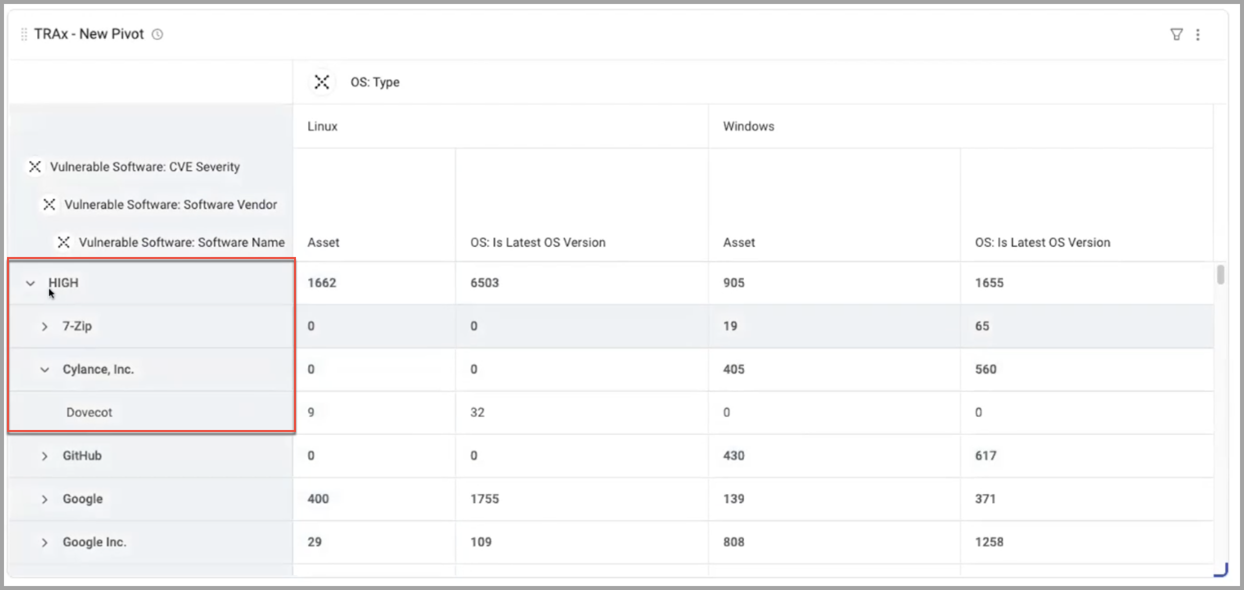
Example of a Table Chart showing Complex Data
For example, you would like to know the number of instances of each specific software application for each CVE Severity Level.
To configure a table chart with complex data:
- On any editable dashboard, click Add Chart or edit an existing chart.
- In the Name field, enter a descriptive name for the chart.
- From the Widget list, select Pivot Chart.
- Under Visualization, select Table.
- Under Data, select the Devices module and the query that will define which assets to include.
- Under Dimensions Row, select the fields whose values will be on the axis of the chart. These are the rows. There will be 2 columns to label the rows. One for each CVE Severity and one for each Software Name.
Vulnerable Software: CVE SeverityVulnerable Software: Software Name
- Under Dimensions Column, select how to separate the values in columns. This will create columns for each OS type with the number of instances of the software with each CVE Severity.
OS: Type
- Under Metrics, select the Measures fields whose values are measured per the axis. This is what will be counted. Under each OS Type will be two columns: one showing the total number of that software, and one showing those that have reached EOS.
Assetswith a function ofCountPreferred OS: Is End of Supportwith a function ofCount True
- Set Calculation preferences.
- Set Presentation preferences.
- Click Save.
Updated 3 days ago