Query Intersection Chart
The Query Intersection chart is a multiple queries metric, consisting of a base query and multiple intersecting queries. You can use this chart to display the number of assets represented by the intersecting queries compared to the base query and highlight the overlap between the intersecting queries.
The following visualizations are supported:
- Pie
- Venn
- Venn Triangle (Axonius Identities users only)
To configure a Query Intersection chart:
-
In Chart title, type a name for the chart.
-
(Optional) Add an optional description if you want.
-
From the Widget dropdown, select Query Intersection.
-
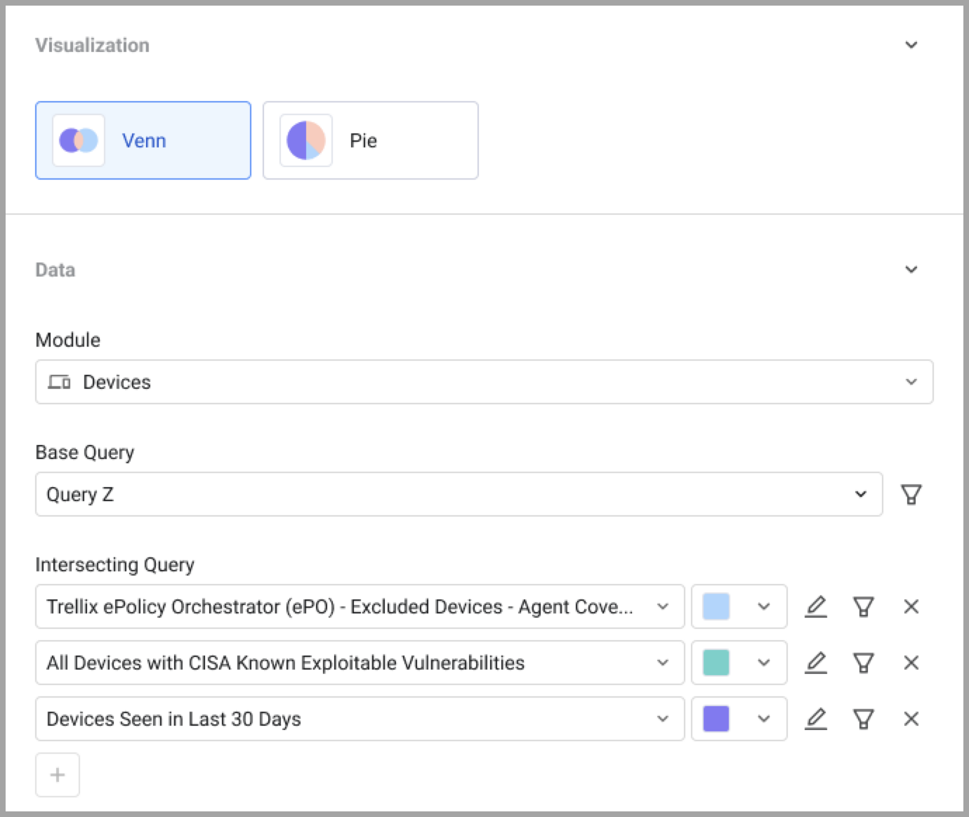
Under Visualization, select a one of the options:
- Pie - Shows the result of up to 2 metrics as a percentage of the total base query entities.
- Venn - Shows results as overlapping circles, highlighting overlaps and exclusivity.
- Venn Triangle - (Axonius Identities users only) Shows results of up to 6 metrics as overlapping triangles.
-
From the Module dropdown, select an asset module.
-
From the Base query dropdown, select or create a base query or leave empty for all entities. Learn more about creating a query.
-
Select or create new intersecting queries.
-
Pie - Select up to 2 intersecting queries.
-
Venn - Select up to 3 intersecting queries.
-
Venn Triangle - Select up to 6 intersecting queries.
As you configure the chart, a preview is created in the left pane. A legend is created with one entry for each section of the graph, including the overlap sections. When you hover over the legend, the areas of the graph are highlighted, and a pop-up displays the details of the highlighted section.
You can assign chart colors to asset count thresholds to easily evaluate the current environment. See Setting Threshold Colors.
-
-
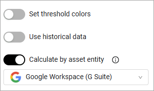
(Optional) To calculate by asset entity instead of aggregated asset fields, select the Calculate by asset entity toggle. You can also select an adapter to calculate by assets fetched from that specific adapter.
- Click Save. A chart is generated and displayed on the dashboard.
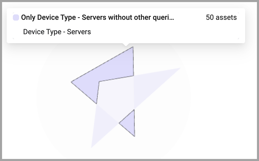
Pie Chart
For example, creating a Query Intersection chart with a base query of all devices, and devices seen in the last 7 days, and with devices seen in the last 30 days as 2 intersecting queries will result in (last 30 days contains all last 7 days devices):
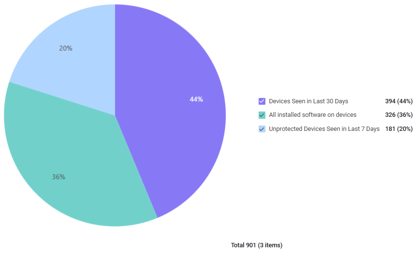
Click the link on each of the slices of the pie chart to see the Devices page displaying the corresponding list of devices.
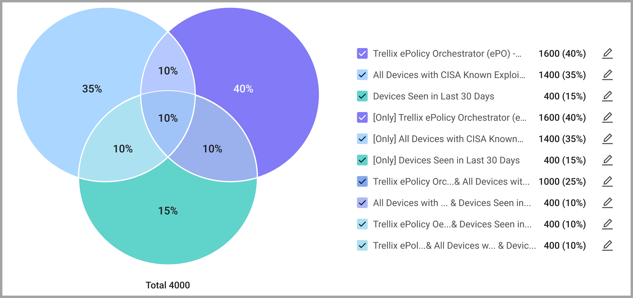
Venn Chart (Circle)
Venn charts offer a simple and intuitive option for the majority of use cases, where you simply need to quickly compare several categories.
Venn charts have the following benefits:
- You can easily see overlaps and exclusivity between 2-3 categories or queries directly in dashboards.
- Analysis of intersections is faster, clearer, and less error-prone, reducing the need for exports and lowering demand on support teams.
- Dashboards are more effective for communication, since circles are intuitive and easy to present to non-technical stakeholders.
Changing the Name of a Venn Circle Chart Section
By default, sections of a Venn circle chart are named after the query they represent. You can change the name of chart sections to something more meaningful.
To change the name of a chart section:
-
Configure the chart how you want it. A preview of the chart is displayed in the preview pane with a legend whose items are labeled after the names of the queries that the sections represent.
-
In the preview pane, click
 (Edit) next to the legend item whose name you want to change.
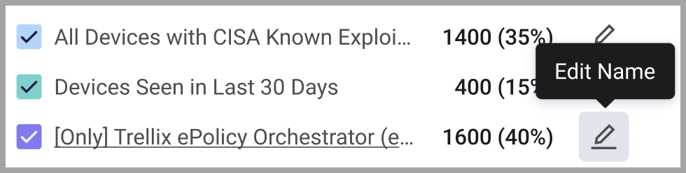
-
In the edit window, enter the name you want.
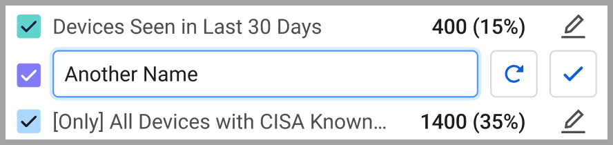
-
Click
 (Save) to save the changes. Click the
  (Reset) to go back to the original name.
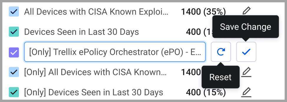
Venn Triangle Chart
This chart visualization is available to Axonius Identities users only.
Hovering over any section of the chart displays a pop-up describing that section.