
Configuring the Stacked Bar Chart in a Percentage/Normalized Mode
The Stacked Bar visualization is available for these charts:
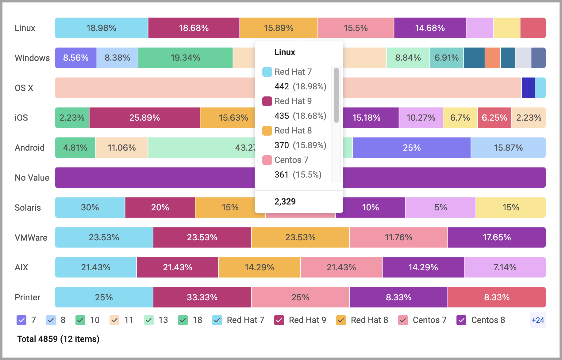
The 100% Stacked Bar chart shows how different constituent parts contribute to a whole, with the total size of the whole always normalized to 100%. You can easily compare the relative magnitude of different categories or groups visually.
Each individual bar in the chart represents a total category (the "whole"), and the segments stacked within that bar represent the different sub-categories (the "parts").
Use the chart to compare the relative proportions or percentage distribution of values across different categories. It shows shifts in asset distribution, changes in status over time, or other measures.
For example, using this mode, you can easily configure a chart that shows the percentage of compliant versus non-compliant assets across departments or asset groups.
You can switch seamlessly between absolute and relative views.
To configure a 100% stacked bar chart:
-
On any editable dashboard, click Add Chart or edit an existing chart.
-
In the Name field, enter a descriptive name for the chart.
-
From the Widget list, select Pivot Chart or Matrix Data.
-
Under Visualization, select Stacked.
-
Configure the chart metrics, dimensions, and other options.
-
Under Segment by, select Percentage and Show Percentage. To switch to an absolute value bar chart, select Number and Show Number. The chart preview updates with other option selections maintained.
-
Click Save.
Hover over a bar to see the breakdown in both percentage and absolute values.
Exporting Chart Information to CSV
When this chart is exported, the data with the percentage values is exported.
Updated 3 days ago