
Map Chart
The Map chart is a visualization of the Pivot chart that displays data on a geographical map. This feature works with the “Activities” module and supports location fields for specific adapters: Okta, Microsoft Azure, and Microsoft Active Directory (AD).
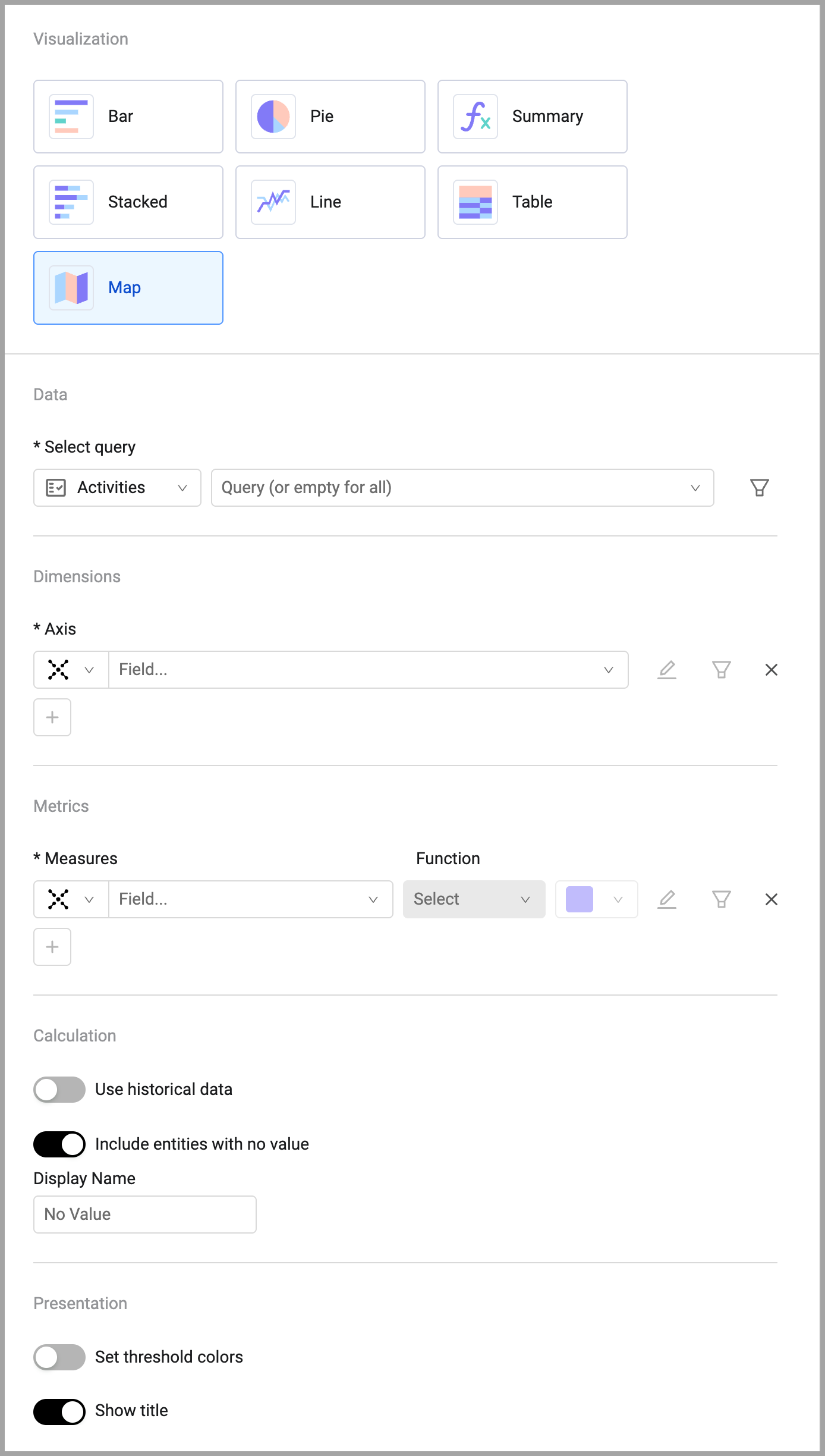
To configure a map chart:
- On any editable dashboard, click Add Chart or edit an existing chart.
- In the Name field, enter a descriptive name for the chart.
- From the Widget list, select Pivot Chart.
- Under Visualization, select Map.
- Under Data, select the Activities module and the query that will define which assets to include.
- Under Dimensions, select the field whose values will be on the axis of the chart.
- Under Metrics, select the field whose value is measured per the axis.
- Under Calculation, select whether to use historical data and whether to include entities with no value.
- Under Presentation, you can set threshold colors and whether to show the chart title on the chart.
- Click Save.
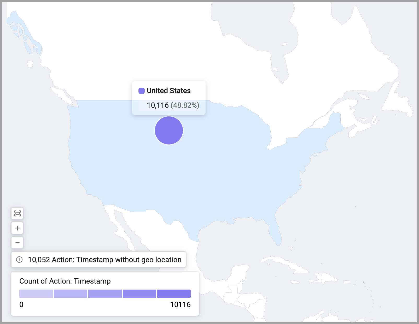
When you hover over a location with data, the data is displayed in a popup.
Updated about 5 hours ago