
Agent Coverage Dashboards
After you finish setting up your device scopes and policies, you can generate a dashboard for each tool in the Agents Deployment Status table.
The charts in each dashboard are dynamic: they visualize posture, KPIs and trends that are synchronized with real-time changes in configuration and policies, updated in the Agent Coverage page.
Important
All Agent Coverage dashboards are managed by Axonius. That means that you cannot edit any of the charts on the dashboard. You can only make edits to your scopes and policies in the Agent Coverage page, and these which will automatically reflect in the dashboard charts.
You can add custom charts to each dashboard, however, these charts will not be automatically updated when you make changes to the Agent Coverage page.
Generating a Dashboard
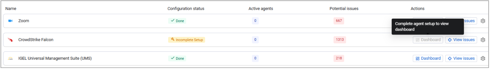
To generate a tool-specific dashboard, go to the Agents deployment status table and from the Actions column, select Dashboard. The Dashboard option is available only for tools whose configuration status is Done, which means you've completed all configurations required to define this tool's coverage scope. When the status is Incomplete Setup, the Dashboard button isn't clickable. See the difference:
The dashboard opens in a new tab.
To access dashboards directly, from the Dashboards general page, navigate to Managed by Axonius > Agent Coverage.
Exploring Dashboard Data
Each dashboard shows the following data and insights:
Scope & Compliance
This section displays charts evaluating the tool’s footprint relative to the total managed inventory, providing a unified health assessment across all selected device categories.
For example: If you have 1000 devices in your organization that are expected to have some agent installed on them (devices in scope - managed & active); and 500 of them have CrowdStrike Falcon installed; then, the Scope & Compliance graph on the CrowdStrike Falcon dashboard page should display 500 CrowdStrike Falcon devices out of 1000 devices in total.
Coverage Status
The charts here show the total counts and proportions of devices based on their overall coverage status (active, inactive, missing, headless) across different device categories.
Coverage Health Trends Over Time
The chart here helps you identify historical trends, spikes, or gradual degradation in coverage health. For example, you can specifically identify changes in the counts of inactive or missing agents over time.
Add Custom Charts
See Working with Charts for more information on creating and managing custom charts.
Reminder
Custom charts are not managed by Axonius, therefore, they are not automatically updated when you make changes to settings on the Agent Coverage page.