Pivot Chart
The Pivot chart provides flexible data segmentation and presentation to support complex data analysis. Use the Pivot chart to segment asset fields from different points of view by measuring the asset field values on a desired asset field segmentation and create a visualization with multiple chart representation options such as bar charts, line charts, pie charts, and more.
Configure the Pivot chart by selecting options in the various configuration sections. The available options in each section reflect the configured settings in previous sections. When all required fields are configured, a preview of the chart is displayed in the preview pane to the right. You can click on a chart segment to view a list of related assets in an asset page table. The columns of the table are updated to match the chart configuration.
Work through the following sections to configure a Pivot chart:
For clarity, the following sections demonstrate the creation of a simple Pivot chart, SaaS Application Activity.
1. General
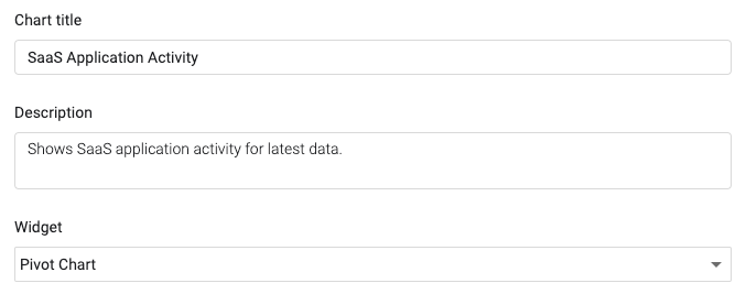
Use General settings to define the name of the chart, add an optional description, and set the type of chart widget.
- Chart title - Enter a descriptive title for the chart.
- Description - Enter an optional description about what the chart shows, the data and/or query it uses, etc.
- Widget - Select Pivot Chart.
In this example, the chart title is SaaS Application Activity. There is an appropriate description and Pivot Chart is selected as the widget.
2. Visualization
The Pivot chart allows you to select from a range of chart types.
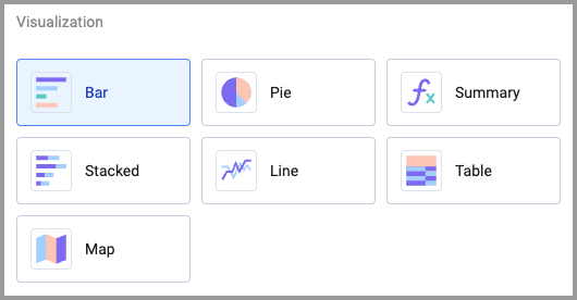
Select the chart type that best represents the data you want to see:
- Bar - Shows data in vertical bars to compare values across categories.
- Pie - Visualizes proportions by dividing data into different colored slices, showing how each part contributes to a whole.
- Summary - Shows just the number corresponding to the chart's metric without an added dimension. You can use this option to create Dashboard charts that display one data point.
- Stacked - Displays bars divided into segments to represent different asset groups or other segmentation.
- Line - Connects data points with lines to show trends or changes over time.
- Table - Organizes data into a table format, making it easier to analyze relationships or comparisons.
- Map - Displays the geographic location of assets on a map. See Using the Pivot Chart Map Visualization.
Note
The selected chart type determines the options available in the other configuration sections.
In the example above, Stacked is selected as the chart visualization and it segments the data by a particular field. A total of all found assets appears at the end of the bar, while each stacked section of the bar represents a segment of data.
The following sections will describe how to select the various data, metrics, and calculations that will determine what data to display and how.
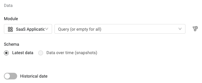
3. Data
Use the Data settings to select the query that determines the data that is displayed on the chart.
-
Under Module, select an asset module and a query. You can also click + Add Query at the bottom of the list to create a new query. See Creating Queries with the Query Wizard for more about creating queries.
-
Under Schema, select whether to use current or historical data in the chart:
- Latest data - Use data from the latest fetch. Aggregates data by the asset Date field.
- Data over time (snapshots) - Use data from historical snapshots. When some modules, such as Adapter Fetch History or Activity Logs, are selected, this option is not available.
-
Show results for previous date - Only available when Latest data is selected. Toggle on to choose a specific fixed date or a date relative to the current date. See Viewing Query Results from a Historical Date.
For this example, SaaS Applications is selected as the module and the query is left empty to include all SaaS applications. This will return data about all SaaS applications. In addition, under Schema, Latest data is selected to use data from the most recent fetch.
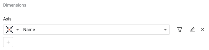
4. Dimensions
Select the data segmentation to be represented on the axis. Data from the query in the Data section will be segmented according to the field selected here.
Notes
When the Summary visualization is selected, the Dimensions area is hidden.
To configure a Stacked chart with two dimensions, see Configuring a Stacked Bar Chart with Two Dimensions.
Under Axis, select an adapter and field.
-
Click the filter icon
 to filter the data returned by the selected query. When a filter is applied, a red dot appears on the filter icon. To clear the filter, click the icon, and then Clear and Save.
 -
Click the edit icon
 to assign a custom name to the axis. This is useful when you want a more representative name than the field name itself. When a custom name is applied, a red dot appears on the pencil icon. To clear the custom name, click the icon, and then Clear and Save. For Date fields, this functionality also allows for editing how the date is aggregated and displayed. For more information see Editing Date Fields below.
 -
Click the add icon
 to add another axis dimension. If the selected chart type doesn't support multiple dimensions, this will be disabled.
NOTE
You can select up to 1 dimension column and 3 dimension rows. When you select a dimension column, you can select up to 2 dimension rows.
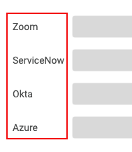
For this example, the field Name is selected. This means that data will be segmented by SaaS application name and the axis label adjacent to each bar will be the name of the corresponding SaaS application name. The chart below shows axis labels for the SaaS applications: Zoom, ServiceNow, Okta, and Azure.
The values represented by the bars and that appear to the right of them are determined by the next two settings, Metrics and Calculation.
The amount of data that can be displayed per dimension, depends on how many dimensions are selected in the chart: 1 Dimension - Up to 1,000,000 dimension rows or
See Editing Number and Date Fields.
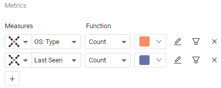
5. Metrics
Select the values within the Dimensions selected above that you want to count or total in the chart.
- Select an adapter and a field. Some chart types allow you to select multiple measures.
-
Select a calculation function for the measure. For more information, see the Calculation section below.
-
Specify a color for the measure to be displayed in. This functionality is supported in Bar, Stacked Bar, and Matrix chart visualizations. The option is only displayed when the Set Threshold Color toggle is set to Off.
-
Click the filter icon
to filter the data returned by the selected query. When a filter is applied, a red dot appears on the filter icon. To clear the filter, click the icon, and then Clear and Save. -
Click the edit icon
to assign a custom name to the measure. This is useful when you want a more representative name than the field name itself. When a custom name is applied, a red dot appears on the pencil icon. To clear the custom name, click the icon, and then Clear and Save. -
Click
to add another measure. If the selected chart type doesn't support multiple measures, this will be disabled.
For this example, the screen below shows five different user statuses selected as the measures in this example. These will return the number of users per status per SaaS application as selected in the Dimensions section above. The chart will display the users per status for each application. Each bar in the chart represents a SaaS application and will be segmented to display the number of users per user account status.
NOTE
When using the Matrix visualization, you can select up to 10 measurements.
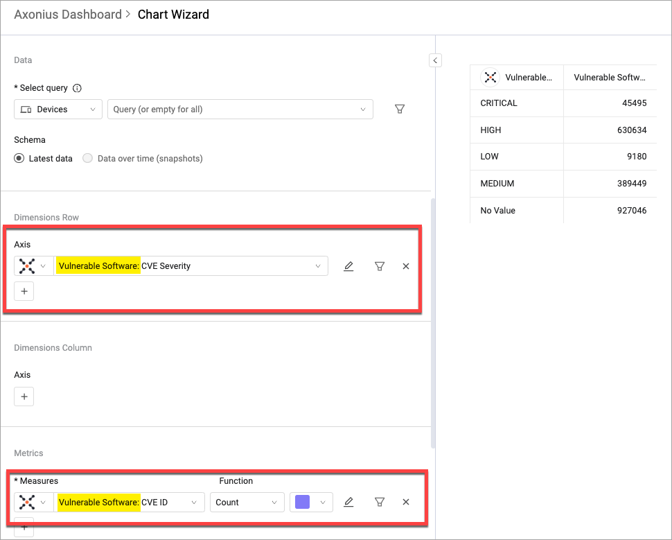
Segment a Complex Field
You can use the Pivot Chart to display data from a complex field, segmented by another field within the same complex field. This allows for more granular analysis and flexibility in how you display your data. 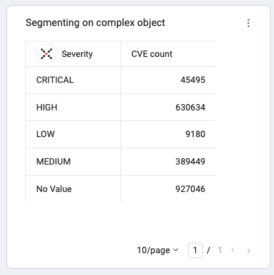
For example, you can display a device's vulnerable software by CVE severity and count the CVE IDs associated with each severity level. This way the segmentation is performed on the Complex Table level.
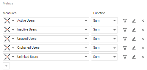
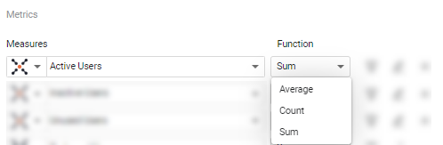
6. Calculation
Select the calculation function you want. The available functions depend on the field type. You can apply a different function to each of the Measures in the Metrics section.
For this example, the Sum function is selected for each measure. This will calculate the total number of users per SaaS application, segmented by user status.
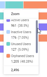
You can mouse over a chart bar to see the segmentation displayed in a tooltip with the total number of users of each status.
The following table describes the calculation functions available for each field type.
| Function | Boolean | Numeric | Text | Notes |
|---|---|---|---|---|
| Sum | * | Total sum of values from fields | ||
| Average | * | Calculates the average | ||
| Count | * | Number of assets | ||
| Count True | * | Number of returned True values | ||
| Count False | * | Number of returned False values |
- Compare results - Display a comparison between the latest data and data from a previous date. See Comparing Today's Query Results to a Previous Date.
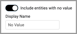
- Include entities with no value - Enable to set a display value for assets that do not have a value for the selected parameters. In the Display Name field, enter the text you want displayed for these assets.
Counting Adapter Connections vs Counting Unique Assets
When using the Count function, you can either count adapter connections or unique assets.
To count the number of adapter connections, select Count under Function in the Metrics section. In general, the count function on shows the number of adapter connections for the selected asset field.
For example, when you filter for a specific asset name and use the Asset Name field with the count function, the Pivot chart shows the number of adapter connections with that asset name.
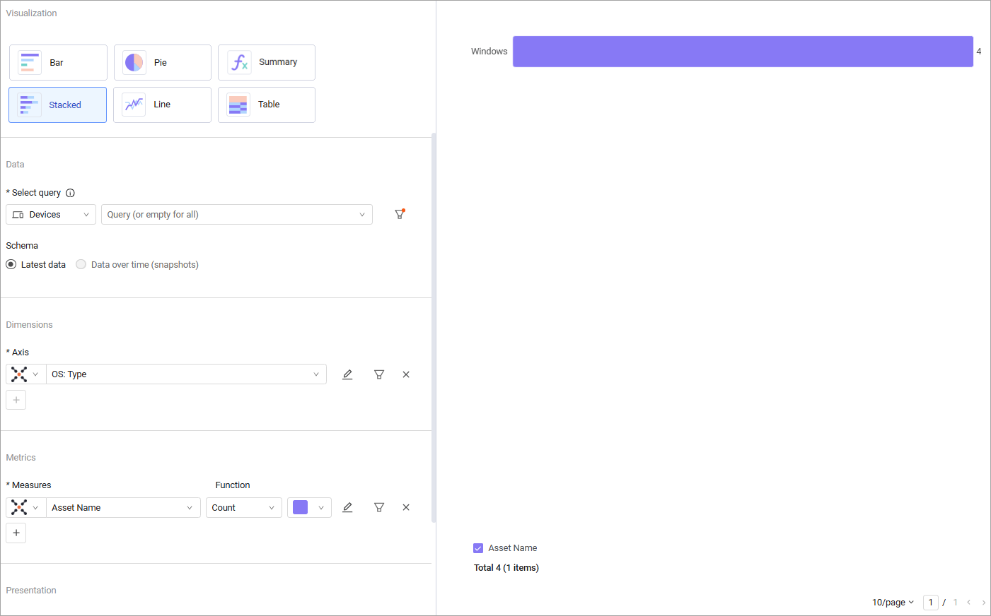
To show the number of unique assets, even though a given asset may repeat across adapter connections, you can select the Asset field with the Count function. In the same example, when we replace the Asset Name field with the Asset field, the number displayed will represent the number of unique assets with that asset name. 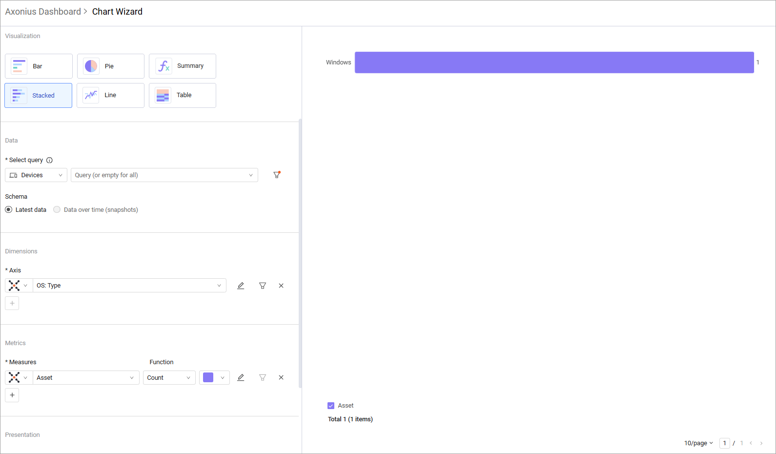
7. Presentation
Use the Presentation options to configure how the data in the chart is presented. 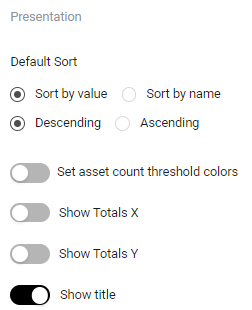
Select a default sort method for the bars, slices, or lines:
-
Sort by value or Sort by name - Sort by the values or by the name of the value.
-
Ascending or Descending - Sort in ascending or descending order.
Additional Presentation settings:
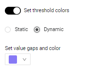
- Set threshold colors - Toggle on to set threshold colors. See Setting Threshold Colors. When the Matrix visualization is selected, you can choose the following options for a color threshold:
-
Static - Set the threshold for displaying the fields in the selected colors.
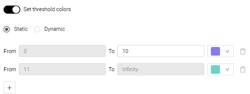
-
Dynamic - Automatically distribute the color intensity from the lowest to highest values in the table.
-
- Compare results to a previous date - In bar charts, compare today's query results to a previous date. See Comparing Today's Query Results to a Previous Date.
- Use historical data - Set the chart to display results from a relative or fixed historical date. See Viewing Query Results from a Historical Date.
- Show title - Toggle on to show the title of the chart from the Chart title field.
- Show totals - Toggle on to show totals.
-
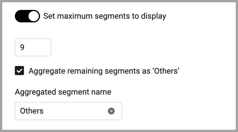
Set maximum segments to display (for bar charts) - Set the maximum number of segment bars to display in the chart. The default minimum is 10. The maximum is 20. When there are more than the set default number of segments, you can aggregate the remaining segments into one by enabling Aggregate remaining segments as ‘Others’. In the Aggregated Segment name field, enter a display name for the aggregation.
Timeline Visualization
When using the Timeline visualization, set the following:
-
In Aggregate by, select an aggregation time period: Day, Week, Month Quarter, or Year. Query results for weekly, monthly, quarterly, and yearly time periods are aggregated based on the average values for the selected time period. Each data point for weekly aggregation is the average of all daily values since the last weekly period. And each data point for the monthly aggregation is the average of all daily values since the last monthly period. You can choose to exclude date ranges from the displayed range. The legend reflects the time period selected.
Note:
On the daily aggregation chart, you can click through to the asset list.
- Y-axis settings - Select the minimum and maximum values for the y-axis.
Setting Timeline Chart y-axis Min/Max Values
Timeline charts display information as line charts on an x,y grid. Although, by default y-axis minimum and maximum values are set automatically, they can be set manually so that data from different queries that have different value ranges can be displayed properly on one chart.
Note:
The configured minimum and maximum values are used as an approximation and may be adjusted to fit the data properly.
To set y-axis minimum/maximum values
-
Navigate to the dashboard you want and find the chart.
-
Click the More (three dots) menu in the upper-right corner of the chart and select Edit.
-
Scroll down to Y-axis settings and do the following:
- To set a minimum value, toggle Axis minimum and enter a value in the text box.
- To set a maximum value, toggle Axis maximum and enter a value in the text box.
@(Info)(Note:)(When the calculation method is Percent, the y-axis minimum is 0 (zero) and the y-axis maximum is 100.)
Changes are applied immediately and appear in the left pane of the Edit window.
-
Click Save.
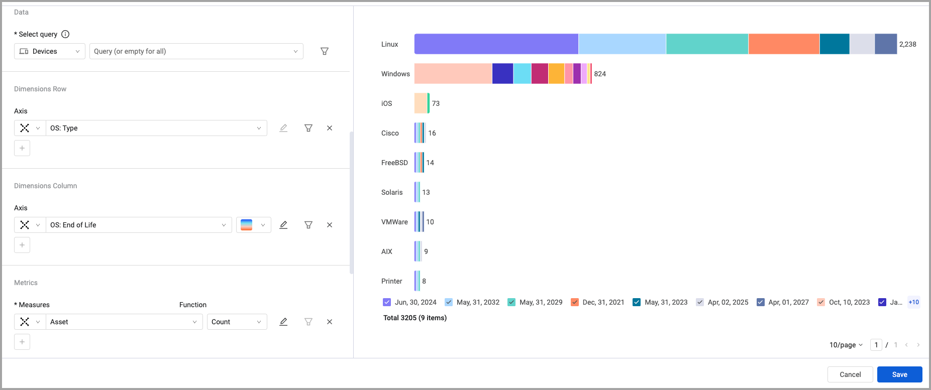
Configuring a Stacked Bar Chart with Two Dimensions
You can configure the Pivot chart Stacked chart style to display two dimensions: one dimension defines the y-axis, for example, "Last Status Update" grouped by month. The second dimension, for example, "Status", determines the stacking within each bar. The x-axis will represent the count of vulnerability instances. 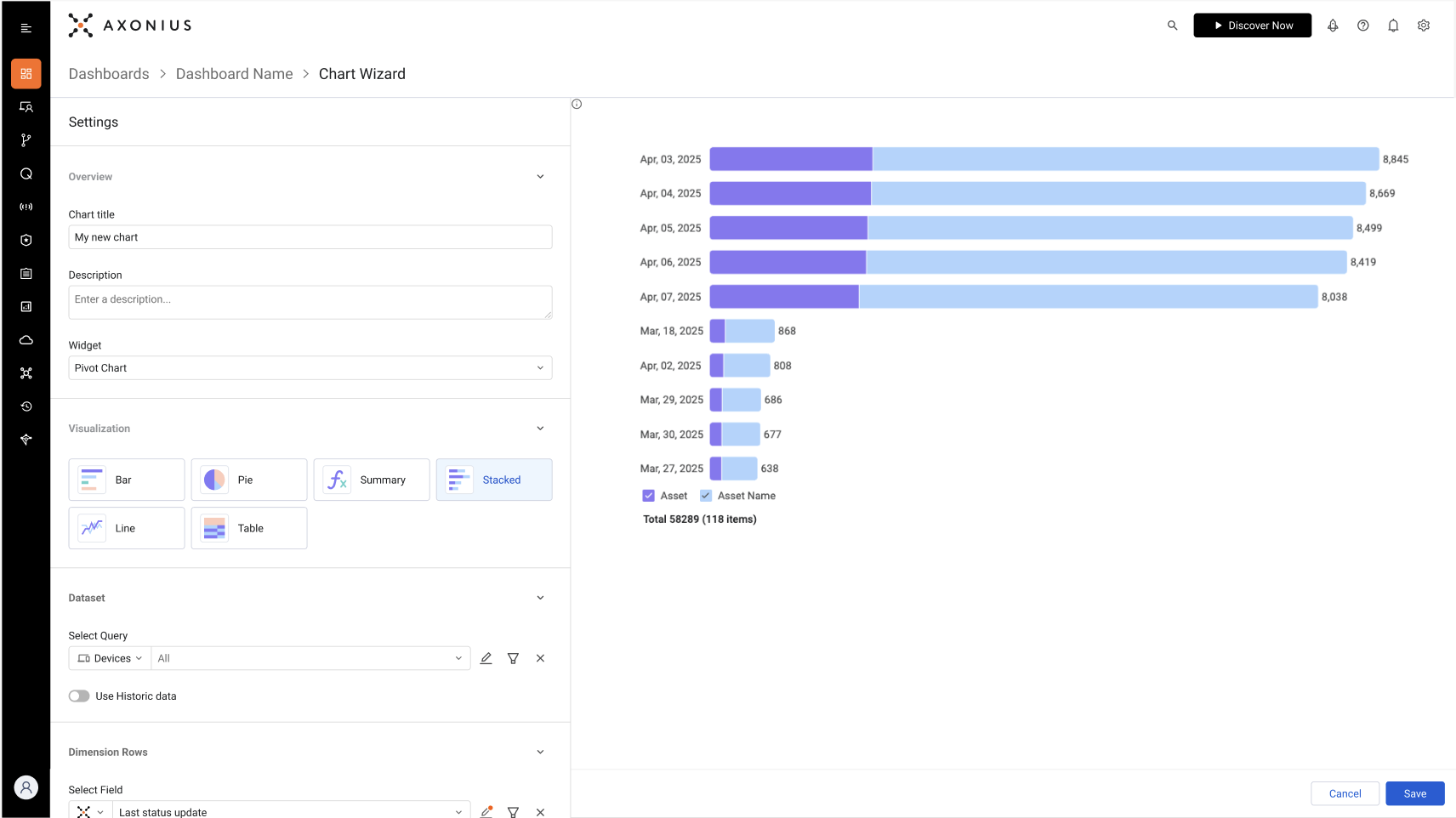
- Under Data, select the asset type and query that defines which asset information to include in the chart.
- Under Dimensions Row, select the field whose value will be the y-axis. This defines what each bar represents.
- Under Dimensions Column, select the field whose value determines the stacking in each bar. In the example given above, each bar represents a date when assets were last updated with stacking by the status.
- Under Metrics, select the field whose value determines the x-axis. In the example, this is the count of vulnerability instances returned by the query.
- Configure the rest of the options and click Save.
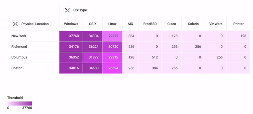
The screenshot below shows the configuration for a Stacked bar chart with two dimensions as follows:
- y-axis - OS type
- Stacking - OS end-of-life
- x-axis - The count of assets
Each bar section shows the number of assets with an end-of-life for the specific date.